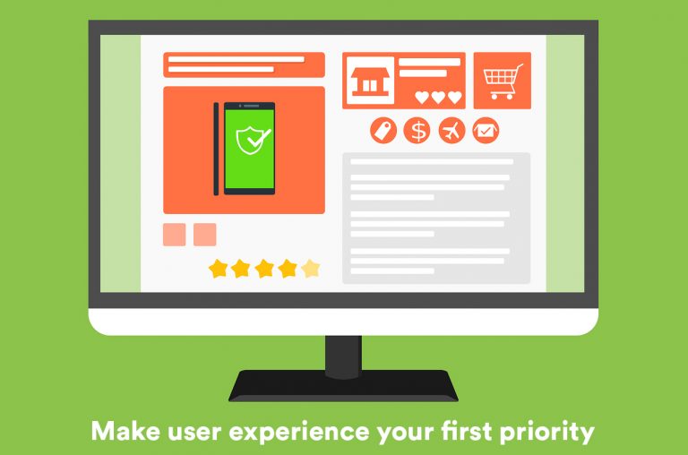
Do you sometimes get a good feeling when your customer is frequently browsing your online store? If you want to make your online store more active, you’ll likely be selling experience before selling the actual product.
What makes successful e-commerce stores successful? Web design and good customer experience are the best marketing tools at your disposal. By providing your customers with excellent user experience, not only will they spend more time in your e-commerce store and be compelled to make a purchase, but they will also keep coming back to check out your new offers.
The feeling of comfort the sense of pleasure; the belief that somebody cares when you’re offered good user experience.
Therefore, good user experience is a crucial factor that targets a visitor needs. How your site looks is the very first impression you are going to make on your visitor mind and how well you understand a customer journey while making a purchase adds a great value to it.
So what is User Experience?
User Experience is all about getting inside the peak of your visitor. It’s all about designing a website which creates a simple, seamless, and pleasant experience for your users. The idea is to deliver information instantly and even make them smile.
To design a seamless user experience, the web layout should display information that the visitor is looking for. Also, that makes them more likely to trust you. Crucially, it presents them more likely to buy from you.
What happens with bad user experience?
On the other hand, poor customer experience can be a huge opportunity cost for your company. You’ve just lost an opportunity to create a good experience that has the customer raving about your app or website and suggesting it to others. They may even go the opposite way and tell others about the poor experience they had instead.
Here, make Good UX at your highest priority.
How do some websites use clever tricks to encourage their visitors to buy?

Let’s consider these common browsing steps that help in calculating eCommerce website conversion. The customer’s number gradually decreases from first to last steps. We need to work on every step to remove the flaws and build conversion.
To Begin with the Homepage
The homepage is the first digital space where your customer lands from a search result or by clicking on an ad. Think it to be the lobby area where you will welcome your buyers if it had been an offline store.
Here are few tips to manage your homepage efficiently.
Home Page Do’s
- Give your customers a wide, visible and ever-present search bar.
- A well-organized navigation bar.
- User your customer’s browsing history for personalization.
- A shopping cart showing the number of items, total order value.
- It is advisable to do A/B test what products to display on the homepage.
- Using high-quality images always attracts and encourage customers.
Home Page Don’ts
- Avoid too much and fast rotation of carousels
- If you are having a sale going on, don’t hide. Flaunt it.

A wide visible search bar always helps!
If a customer recognises exactly what they are looking for, the most important thing they will see for on your site is a search bar. If the search engine doesn’t find the product they were searching for, the consumer will get frustrated and leave.
- Make sure you attach a search bar to your eCommerce site that is always visible.
- Upgrade your search feature to have auto-complete functionality.
- Giving a search suggestion is an added advantage.
- Make sure that the search feature runs well and has filters for letting customers refine their results.

Display Shopping cart Icon
One of the best e-commerce homepage design best practices is to show the shopping cart icon to the top right-hand side of the homepage.
This cart should appear with the items customers have left unpurchased in their last visit.
- Display total price of product and number of items in the cart.
- Allow customer to edit their cart anytime.
- Provide a link to the mini cart to view the full page cart instead of taking the user directly to checkout.
Category page
The category page – perhaps the most familiar page of the modern eCommerce website.
The category pages of your online shop are like tiny home pages for the product groups you carry. This guide shows you how to effectively present a range of products and help your customers find the best product for their needs.
Here are few tips to make your catalogue page user-friendly,
Category Page Do’s
- Consider having “what’s new” category or filter.
- Make sure categories are clickable and direct to the product page.
- Select the clear font and correct size for section titles.
- Keep the filters meaningful.
For example, you are selling clothes, so their filters include things like size, colour, brand and so on.
- Below product image, provide product name with price, discount, ratings, availability, EMI options if applicable, etc.

- Highlight the given link to the page the visitor is currently on, wherever possible.
- Use only high-quality, optimized image.
Category Page Don’ts
- Avoid Keeping category names irrelevant and difficult to understand.
- Long product description on the category page.
- Low-quality images with text on it.
- No standard size of products images.
- Avoid unnecessary space wherever possible.


Tips for Product Detail Page
Product detail pages provide product information that customers desire, allow customers to experience the product from their device, and an optimized product detail page will drive traffic to your store which you would miss otherwise.
Drive your customer to the checkout page using few detail page tips.
Product Detail Page Do’s
- Make sure your breadcrumb is not overeating space. Keep it optimized.
- Place product name with visible bold fonts.
- High-quality product images.
- Show product images in context. Ex. Don’t just show a t-shirt with hanger, try to keep pictures with a model wearing it.
- Avoid drop-down menus whenever possible.
- Visible call to actions – Add to cart, Buy Now, add to wishlist etc.
- Inform customers if the item is available.
- Put powerful product description and allows the user to read product reviews.
- Avoid pre-selected SKU options.

Checkout Process UX Tips
Remember, help them then they help you. Your checkout process should be smooth and less complicated with least possible clicks. So, the customer can quickly process and complete their online shopping.
The Do’s
- Allow customers to modify the order easily.
- Keep the ‘Back’ button fully functional.
- Provide product name, product image and short specifications of the item for customers to recheck and confirm.
- If possible, provide a progress bar to let a customer know the steps included.
- Let checkout interface user-friendly and straightforward with minimum navigations.
- Let your customer know the expected delivery times.
- Leave a thank you note.


The don’ts
- Don’t require registration to shop. Allow guest checkouts.
- At this step, don’t force your customer to read unwanted information. Try using minimum pop-ups and scroll here.
Bonus: Make mobile site your first priority

For those who’d like to go in-depth about which areas on their eCommerce website get maximum user attention and to optimize such space and make a memorable user experience should try heat map analysis.
In short, designing your eCommerce store is not only about making it look good, but also making sure that it generates sales. In this article, we have highlighted several e-commerce best practices that will keep your customers happy and improve your sales. Talk to the E-commerce experts to start or revamp Your store.


Leave a Reply